'Display' options settings
Overview

The Display option within the Editor's Popup Settings box contains 5 option categories. They include, from left to right:
- Appearance
- Size
- Animation
- Position
- Advanced
This article briefly describes each of the properties assigned within each option category.
Article Contents
- Category: Appearance
- Property Description
- Property Description
- Category: Size
- Property Descriptions
- Property Descriptions
- Category: Animation
- Property Descriptions
- Property Descriptions
- Category: Position
- Property Descriptions
- Property Descriptions
- Category: Advanced
- Property Descriptions
Category: Appearance
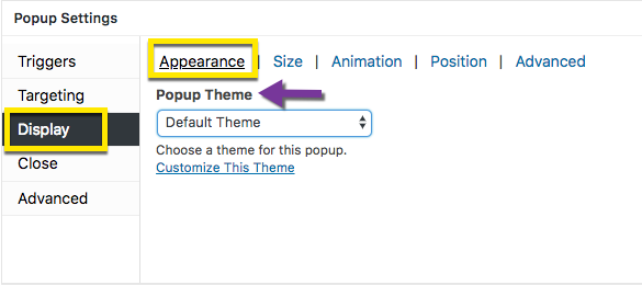
Choose a Popup Theme for this popup. Options include the 6 themes preinstalled on plugin activation, and any additional saved custom themes.
Related article: Popup Theme Editor -- Introduction
Property Description
Popup Theme -- The preset style of the popup container and background surrounding the container. Default: 'Default Theme'.
The default popup theme for each new popup is set on the Settings >> General admin page. See the related article on how to change this setting.
Related article: Settings submenu
Category: Size

Select the size of the popup. The plugin includes 8 sizes that responsively adjust inside the screen window. Custom, non-responsive sizing can also be selected.
Property Descriptions
Size -- The size of the popup relative to the surrounding screen window. Responsive sized popups provide equivalent padding between the right and left sides of the popup container and the browser window. See 'Auto' size below for comparison.
- Options: Responsive Sizes (8):
- Nano - 10%;
- Micro - 20%;
- Tiny - 30%;
- Small - 40%;
- Medium - 60% (plugin default);
- Normal - 70%;
- Large - 80%;
- X-Large - 95%.
- Options: Non-responsive Sizes (2):
- Auto -- The popup container automatically fills the width of the browser window. No padding is provided between the popup container and the window.
- Custom -- The popup width and height are set, and do not resize as the screen size becomes smaller. Select this option if you intend to display a popup only on a desktop screen.
Default: 640 px wide x 380 px high. Optional Units: %, em, rem.
Min Width -- The minimum width set for the popup. This property is only available for popups set to resize responsively. Default: 0%. Optional Units: px (pixels), em, rem.
Max Width -- The maximum width set for the popup. This property is only available for popups set to resize responsively. Default: 100%. Optional Units: px (pixels), em, rem.
Auto Adjust Height (checkbox) -- Available when Size: Custom selected. This setting changes the height of the popup container to display all of the popup's contents. If the auto adjusted height is likely to exceed the height of the screen, use the 'Scrollable Content' property instead to allow visitors to vertically scroll the content inside the popup. Default: unchecked (off).
Scrollable Content (checkbox) -- Available when Size: Custom selected. Allows for vertical scrolling of content inside a popup. Use this property when the length of the content exceeds the normal height of a popup. Default: unchecked (off).
Category: Animation

Select the type and speed of animation to display when a popup opens.
Property Descriptions
Animation Type -- You can choose None, Slide, Fade (the default), or Fade and Slide.
Animation Speed -- This is how long you want your animation to take. For example, if you set this to 1000 ms with Fade selected, it will take 1 second for your popup to fade into view. The default is 350 ms (milliseconds) or 0.350 seconds.
You can adjust the speed using the slider knob, by typing a number into the input field, and by clicking the -/+ buttons. If you use the slider, the lowest speed is 50 ms while the default highest is 1000 ms (1 second). We recommend using something in this range.
Note: There is no animation for when a popup closes. When you click the close button, the popup closes instantly
Animation Origin -- This setting is available only for Slide and Fade and Slide. Choose from where you want your popup to slide into view. In the example below, the Automation Origin is set to Bottom Left.

Category: Position

Select the point to anchor the popup container inside the browser window. Options are available to position a popup relative a Click Open trigger, and set a popup to a fixed position.
Property Descriptions
Location -- The point inside the browser window to anchor the popup container.
Default: Top Center.
Options ( 9 ):
- Top Left;
- Top Center;
- Top Right;
- Middle Left;
- Middle Center;
- Middle Right;
- Bottom Left;
- Bottom Center; and
- Bottom Right
Top (range finder) -- The distance (measured in pixels) between the top of the popup container and the top of the browser window. The property is active when Location is set to either Top Left, Top Center, or Top Right. Default: 100 px. Range: 0 - 500 px.
Left (range finder) -- The distance between the left side of the popup container and the left side of the browser window. The property is active when Location is set to either Top Left, Middle Left, or Bottom Left. Default: 0 px. Range: 0 - 500 px.
Right (range finder) -- The distance between the right side of the popup container and the right side of the browser window. The property is active when Location is set to either Top Right, Middle Right, or Bottom Right. Default: 0 px. Range: 0 - 500 px.
Bottom (range finder) -- The distance (measured in pixels) between the bottom of the popup container and the bottom of the browser window. The property is active when Location is set to either Bottom Left, Bottom Center, or Bottom Right. Default: 0 px. Range: 0 - 500 px.
Position From Trigger (checkbox) -- This setting changes the reference frame for a popup from the browser window to a link set with a Click Open trigger. When this feature is active, a popup is anchored as close as possible to the Click trigger, rather than framed relative to the browser window. Default: unchecked (off).
Fixed Positioning (checkbox) -- Use this setting in combination with the Disable Overlay checkbox ( Popup Settings >> Display >> Advanced >> Disable Overlay). When this feature is active, a popup is fixed in position while the screen content can scroll behind the popup. Default: unchecked (off).
Related article: How to Display Different Popup and Overlay Scroll Effects in Combination // Refer to the section 'Popup and Overlay Option Settings for Each Effect', item #3.
Category: Advanced

A collection of specialty settings for managing a popup display. The settings:
- remove the overlay layer from view;
- allow for 2 or more popups to display at the same time;
- disable popup resizing when the window size changes; and
- assign a popup z-index value relative to the browser’s content.
Property Descriptions
Disable Overlay (checkbox) -- Removed the overlay layer from view. See the following related article for an explanation of the overlay layer. Default: unchecked (off).
Related article: Popups Display In Front of Screen Content
Stackable (checkbox) -- By default, Popup Maker is designed to display only one popup on the screen at a time. When selected, this feature allows two or more popups to display together. Default: unchecked (off).
Disable Repositioning (checkbox) -- By default, Popup Maker automatically readjusts the position of a popup container inside the browser window as the screen size changes. When selected, popup repositioning is disabled. Default: unchecked (off).
Popup Z-Index (integer) -- The 'z-index' value determines the placement of vertical layers inside a browser window. Layers with higher z-index values are placed closer to the front of the screen.
By default, the popup container is assigned a high value to ensure it appears in front of all other content inside the browser window. There is usually no reason to change this value. Default: 1999999999.